

nGauge
Engage with your sales, inventory and customer analytics.
As a UX designer for retailcloud, I was asked to find better strategies to organize data and rebrand the application, thereby improve the user experience.
Role
Product designer, Interaction designer
Duration
Oct 2019 - May 2020
Store owners look for a solution to access inventory levels, daily analytics and KPIs at their fingertips.
Project Scope
Redesign product concepts for helping retailers with their daily analytics. Rebranding can offer the stimulation of business needs to create new growth in an ever-evolving market.
Deliverable
Conduct primary research, ideate and construct a system to streamline order, employee, and table management.
BACKGROUND STORY
Small business owners rely on nGuage as their go-to app for monitoring their store’s performance.
Small business owners rely on nGuage daily to track inventory, sales, and top performers, keeping them informed about their store’s performance.

PROBLEMS
..but our research found that there were lack of classification in data.
Users had to scan through data to find important information like sales summary, and top selling items
Additionally, users were spending more time to find ther way around.
Users had to find the top selling products, departments, categories, subcategories separately
Users had to spend time going to each product screen to view product details and sales
Users had to repeatedly apply the same filters across different screens to compare data.

Representation of the mental model of a Tikt merchant
OUr ask
On the found problems the following questions were created.
Can a Sales screen be designed to display all data related to sales?
Can similar data points be grouped and displayed in dropdown cards?
How can a Global Filter and FAB filter be implemented to filter data by day and month?
Can a Product screen include tabs to switch between top-selling products, departments, categories, and subcategories?
How can a global card be created to display product and sales details for a selected product?
How can total customer rating points received by the store be shown based on date and month filters?
Can Daily Sales and Hourly Sales details be effectively displayed?
How can Top Grossing Products be highlighted?
What is the best way to present the quantity or stock on hand?
Design process
SCAMPER
SCAMPER technique is an Idea Manipulation Tool to guide us in generating diverse ideas. Rather than thinking original ideas, I used this tool to gather ideas from divergent fields, manipulate and fuse them into our requirements.
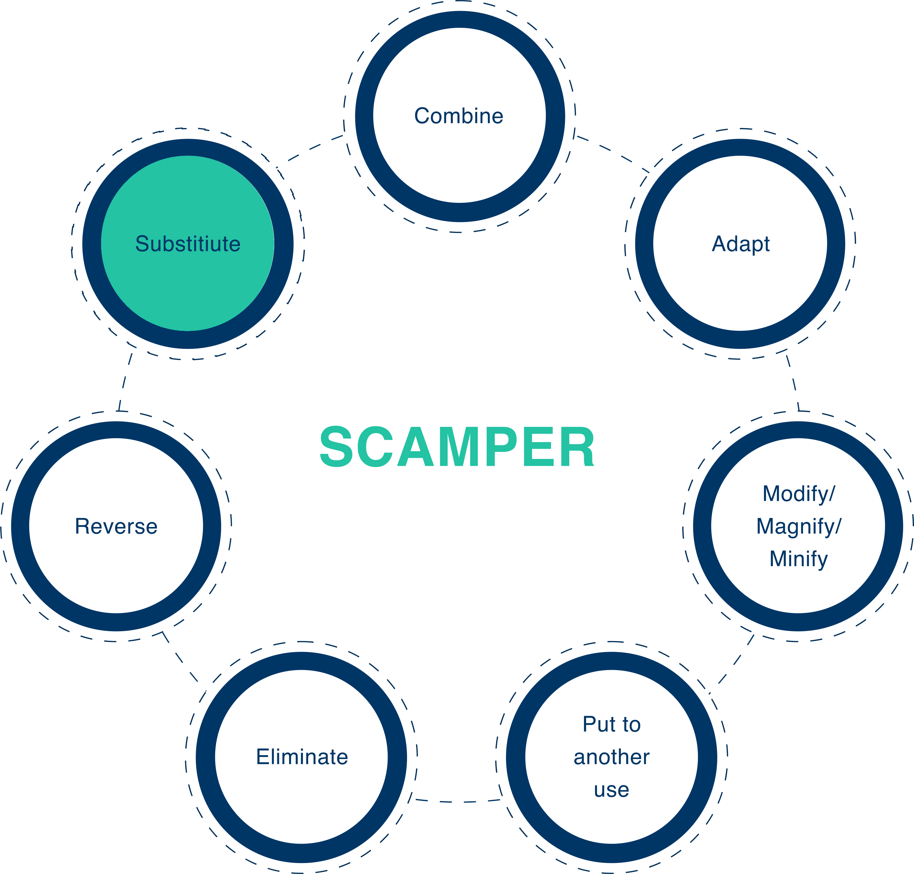
Representation showing seven steps of SCAMPER design process
Substitute
Can I change the colors to bring a modern & vibrant experience?
Colors communicate as powerfully as language, reflecting brand personality, attracting users, and conveying messages effectively.
With a thoughtful UX color palette (shown below), I improved information readability, strengthened calls-to-action, enhanced navigation, satisfied aesthetic needs, and fostered intuitive interactions.

nGauge color palette
Can I change the colors to bring a modern & vibrant experience?
nGauge provides merchants with their Hourly sales, Daily Sales and Payment type used by their customers in store by Bubble or Scattered chart, Area chart and Donut chart respectively.
I managed to improvise the graphs visually as mentioned in the below image and was able to provide a better user experience.

Comparison of graphs before and after scamper
Combine
Can I combine similar data like sales details and margin details?
Can I have customer details under the same hood?
Can I combine top performers details like top selling products, top selling product group, category etc.
Data was spread across the ngauge app, I wanted to club similar data into groups for easy understanding and better user experience. So I used card sorting technique to see how different people would interpret these data and how often they would like to see some of these data together or as a group.
I wrote down all the data points that needed to be clubbed as Cards and with the help of 15 volunteers from within organization and customers, I was able to gather 15 different type of combinations of these data cards. We did a hybrid card sorting so I was able to identify how different people grouped these data and what all group names they liked to call it. Below representation shows 3 such variations out of the 15 participants.

Representation of how card sorting was done by 3 out of 15 participants
I created a matrix with the cards list and group names assigned by the participants of card sorting. I wrote down the number of times a person added a list item to a certain group. This gave an idea about the most used group name and how often list items are added to it. The below representation shown the number of times a card list item is assigned to a group.

Card sorting matrix showing tally of items in card lists assigned to groups
The card sorting matrix makes a clear idea of how customers would like to see the similar data together.
With the card sorting technique, I was able to group data efficiently and was able to design card based UI for the same as shown below.
Sales screen

Customer screen

Top seller
Final product build with the help of card sorting data
Adapt
Can I have the mostly used feedback section?
Can I have positive and negative reviews separately?
Feedback is one of the most commonly wanted feature for a merchant about their store.
I wanted to adapt the common feedback user experience that is to have a positive and negative feedback section, so that merchants can easily switch between them.

Representation of positive and negative feedback sections
Modify
Can I modify filter to have a global filter?
The filters in ngauge allow customers to view their stores KPI's with respect to day and month. This have to be applied in each screen to sort data and was consuming more space in doing so.
I wanted to use the screen real estate more effectively. So I made the filters into a FAB (floating action button) so that it can be hid when applied and can be applied consistently.

Comparison of filters before and after SCAMPER
Can I modify the icons?
As a brand Iconography plays an important role. I wanted to have the icons meaningful, consistent and accessible. With the updated icon pack I was able to convey meaning of a subject much easily and thereby improve the user experience.

Image showing the Icons used throughout the ngauge app
Can I modify the logo?
A great logo is a great brand! With a ton of options available in the App Store and Play Store, the pictorial representation of the app is important to catch the user's attention and keep the app easily recognizable.
So I wanted to create a unique and simple logo that directly conveying the analytical capabilities of the app. I came up with different ideas and with some feedback I created this combo of search and analytics logo as shown below. The updated logo was able to bring in a fresh feel and excitement to the users.

Image showing the ideation process of the app logo
Can I modify Typography?
The role of typography is significant enough to change user perception with subtle diversities between typefaces. I modified the typography with suitable fonts and sizes to increasing and retaining user attention, it helped in connecting with the user and enhancing app efficiency.

Image showing the type scale used in the application
Put to Another Use
Can I show the best seller from top selling products?
Can I use customer engagement index to create customer rating radar?
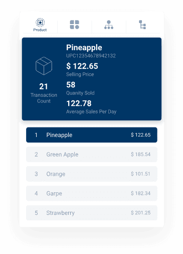
Merchants likes to see their top selling products very often. So I used the top seller details to display the best seller product in the main screen. This made the life easier for merchants, they no longer need to scan for the product details to find the best selling product.
Ratings provided by all the customers was used to create the customer engagement index. This was able to provide an overall rating of the store based on past customer ratings and the merchants could know how well the customers like their store.

Image showing the best sellers and the overall customer ratings radar
Eliminate
Can I reduce the number of clicks to get the most viewed details like daily sales, hourly sales, etc.
Can I reduce the effort of applying filter every time on each screen?
Reverse/ Rearrange
Can I rearrange the user flow to have separate tab for KPI's, customer, sales, feedback and products?
Effective and tested user flow is crucial for good user experience. With the details obtained from SCAMPER design process, I was able to modify the user flow and obtain a much effective structure as displayed in the below diagram. The updated user flow provide better understanding of the data to the users and a clean experience.

Representation of updated user flow
Low Fidelity
I was able to build the below prototype with relative ease and was able to represent the ideation concepts into a well structured design.

Image showing the low fidelity prototype
High Fidelity
A high-fidelity prototype provides the level of information necessary for accurate engineering cost estimates, early in the process when these estimates are most useful. It enabled to brainstorm how the UI should interact with customers. I was able to conduct QA and real user test to ensure the user experience is as expected. It enabled and encouraged collaboration between product manager, UX designer, and engineer that is necessary to discover a valuable, useful and feasible product.

Representation of interaction with high fidelity prototype
Microinteractions
Microinteractions provide feedback to the user, often through conveying system status or helping users prevent errors. Additionally, it can be used as a vehicle for branding.
I wanted to make the experience engaging and exciting with animations and microinteractions. Below sections represents few of these and describes its working.
Dashboard Counter
It's always pleasing to see the number counting up as a user. With this dashboard counter interaction I was able to bring a little pizazz to the numbers.
Counter animation makes people remind of the achievement as a store and how well the store is doing as increasing numbers from the start. The interaction also evokes excitement to the users about viewing the dashboard.
Sales Donut
The clockwise wheel animation is commonly used for donut charts. I wanted to bring the usual aspects of the same in the application.
The rotating wheel makes the donut fill up with values in clockwise direction. It makes the chart more engaging and gets the user attention towards the chart and partition of values.
Customer rating radar
Customer rating is important to a store. The filling up animation of radar lets the merchants feel how good is the customer engagement index and how well people likes to visit their store.
The green pulsing heart gives a lovable feeling to the store when the index value is more than half and lets the merchants know by a broken heart that the scores are low. These animations makes the app more accessible and the experience more engaging.

Key takeaways
By redesign the app I was able to brainstorm the app functionalities.
This case study was helpful to bring in clarity to some uncertain topics that deemed importance later on.
SCAMPER was effective and simple design approach that everyone in the team could understand.
The quick design deliverables boosted the feedbacks and kept project on schedule.
Well prepared high fidelity prototype gave a real world experience and that made usability and QA testing with real data.
Proper dev handoff took off the pain of development team and was able to save a lot of dev time by making engineering life simple.
Thanks for reading.
✉ msmanusankar98@gmail.com